Inspiration: Gorgeous Gallery Walls
Putting together a gallery wall in your home consists of more than just randomly arranging different pieces of art in an empty space. It is an expression of style, taste, and aesthetic that can make a big visual impact and tell a story about who lives there, what and who they love, and what makes them happy.
However, hanging up a gallery wall runs the risk of being a painful and complicated project that leaves you with mismatched and crooked prints on the wall. At Modernize, we like to think that home projects-especially the fun design type, like this-should be enjoyable and even easy. Here are some of our favorite gorgeous gallery walls done right.
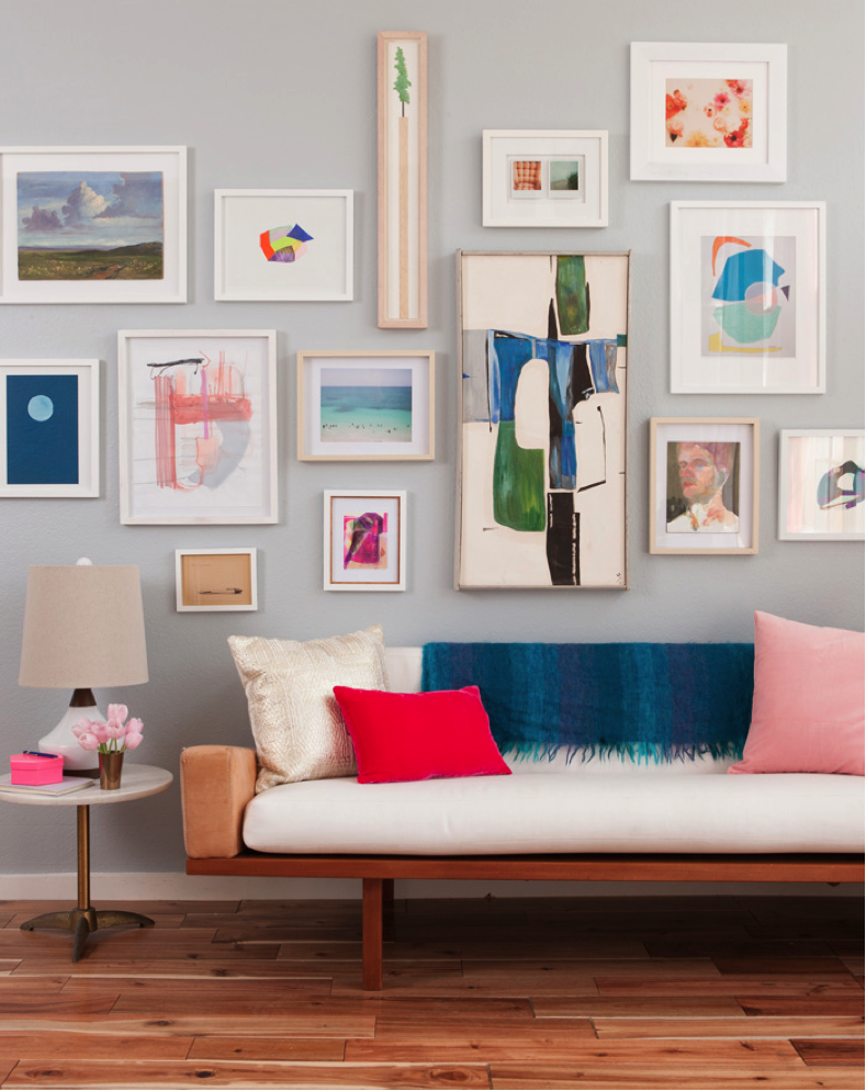
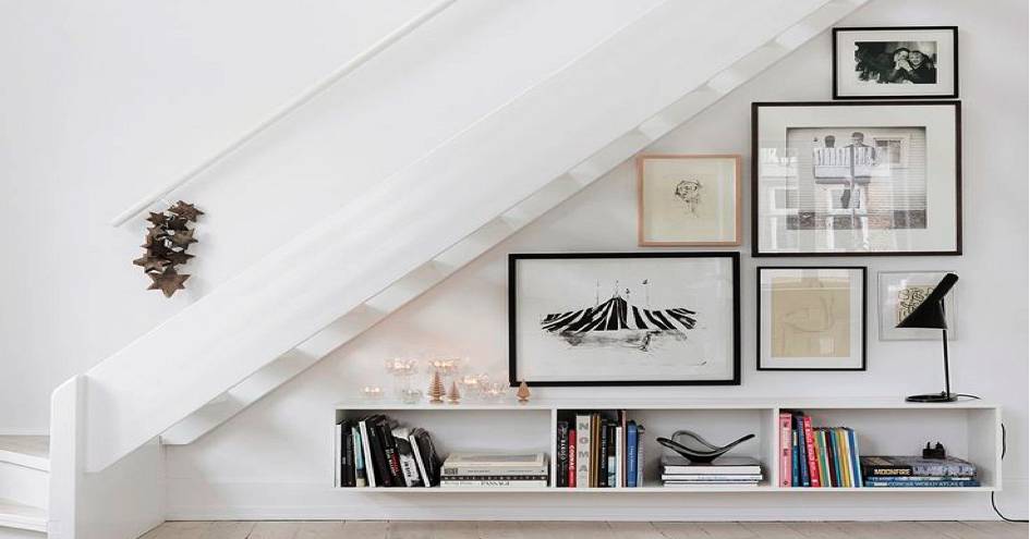
A good gallery should be a focal point that can also blend in a little bit. Gallery walls that are over-the-top have a tendency to look more messy and haphazard than they do creative and whimsical (tip: you want to go more for whimsical). So make sure it complements your space, without being too matchy-matchy, like this one by designer Emily Henderson, who says, "Make sure to have a consistent color palette, but don't get OCD about it. Instead, Give yourself some room to bring in small hits of other colors so you don't look like a crazy uptight person. We started with blues, pinks, and whites but there are a lot of oranges, greens, purples, etc. It's really just a smattering of colors, but they all feel light and happy."
A big mistake that many homeowners often make while designing their gallery wall is to overthink it. As long as it has meaning to you and you love it, then that's all that matters. This means don't limit yourself to photographs and art prints. Pressed botany, old love letters, vintage signage-it all works as art that's specific to your personality. When it comes to hanging up art, especially a gallery wall, sometimes simple is better, not to mention more authentic. So don't drive yourself crazy hunting down unique pieces of art or obsessing over a certain method of arranging everything. As long as it gives you joy and delight, that will be reflected in your home.
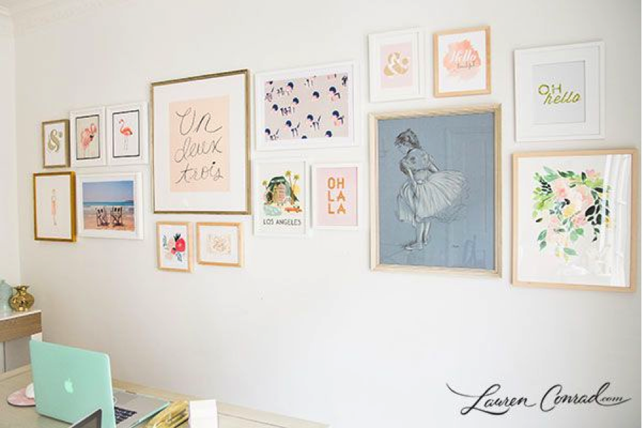
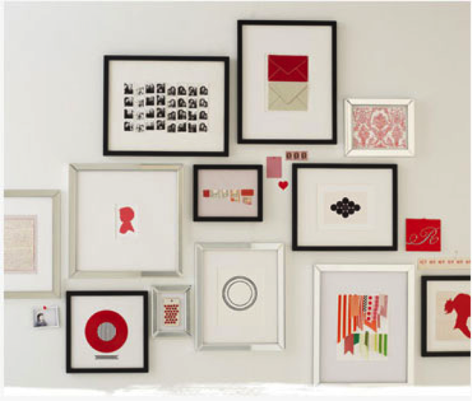
How you frame your art counts almost as much as what's inside it. Coordinate your frame color and material so that it highlights but doesn't overwhelm your pieces. Choose a monochromatic color palette that gives you some freedom to switch things up a little so that you aren't bound to the same beige wooden frame over and over again. Although a little diversity and is a good thing (unless you're going for that kind of look), stay within the parameters of your design idea so that your framed art would look as good on its own as it does alongside the others.
By Katherine Oakes | Modernize
- Topics:
- Home Improvement
- Interior Design

