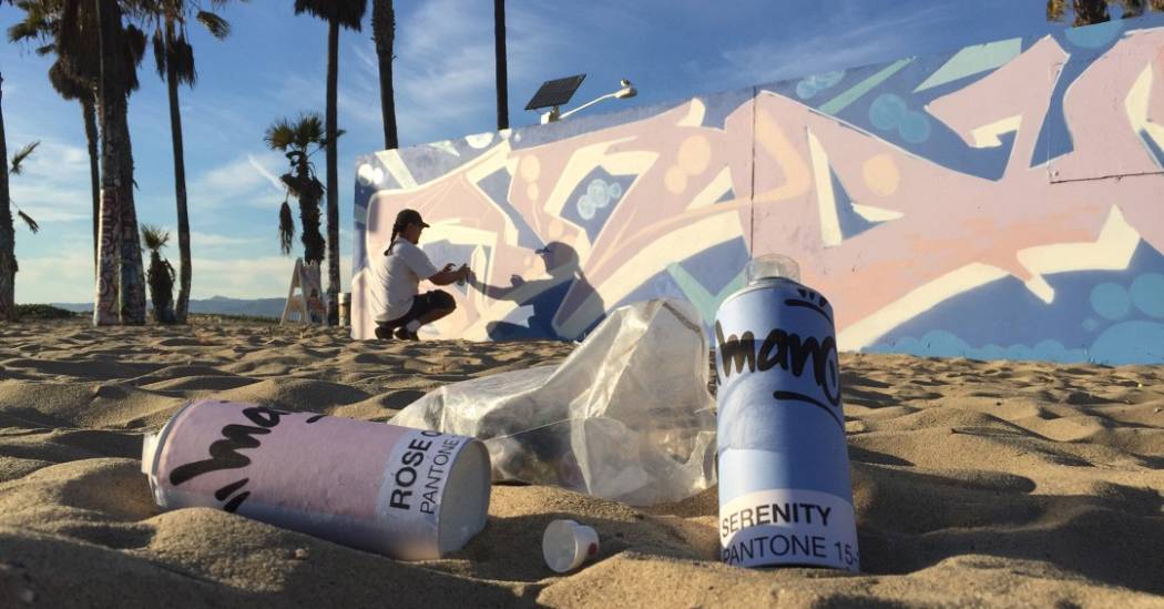
Pantone Color of the Year 2016: ROSE QUARTZ & SERENITY
Pantone selects an annual color as a snapshot and expression into what they see taking place in culture. In a surprise move, this year Pantone selected two colors to represent the "gender blur as it relates to fashion, which has in turn impacted color trends throughout all other areas of design."
This more unilateral approach to color is coinciding with societal movements toward gender equality and fluidity, the consumer’s increased comfort with using color as a form of expression.
Rose Quartz and Serenity represent traditional hues of pink and blue taking on a more fluid identity in a world being shaped continually by a new generation unwilling to let color define identity.
Here are some ways to feature a twist on the traditional into your home with Rose Quartz and Serenity.
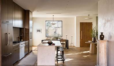
Rose quartz accents add a soft touch in an otherwise sparse space.
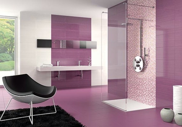
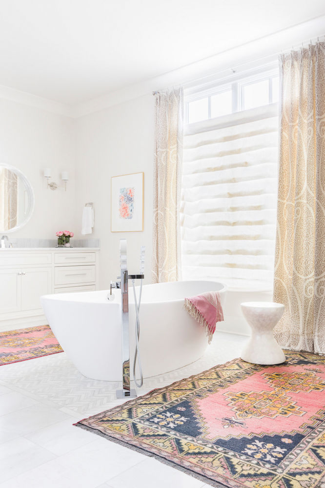
Adding a rose accent wall or rug provides a simple way to incorporate this year's palette.

Not ready for an in-your-face rose wall? Try incorporating this rose quartz to grey gradient and add a touch of texture.
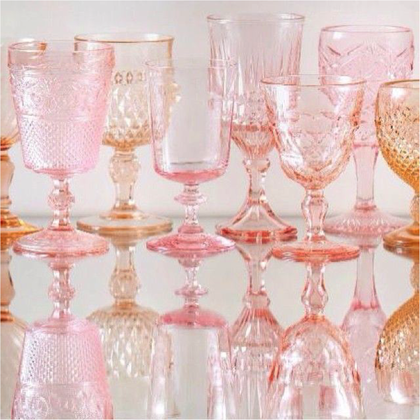
Classic glassware punches up table settings simply and elegantly.
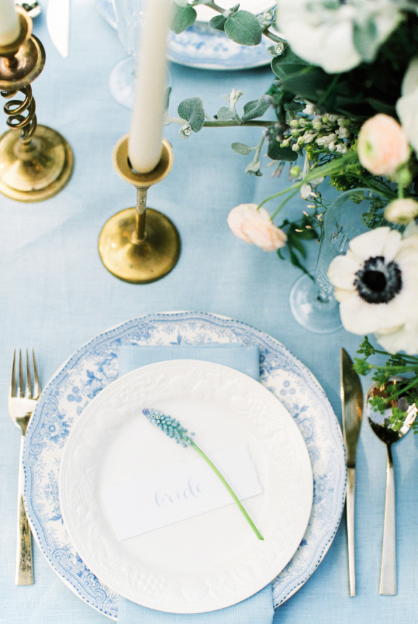 Serenity-toned china and placecards create a timeless ambiance to entertaining.
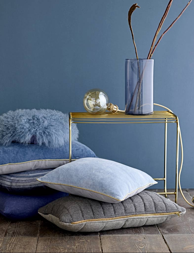
Accent pillows in Serenity and complementary azure shades incorporate a zen vibe to any lounging space.
Which of these Rose Quartz and Serenity color trends would you incorporate into your home decor? Please share your thoughts and leave your comments below.
Photos courtesy of Macala Wright, Domino, AVSO.ORG,
Eclectic Trends, The Glamorous Housewife, Style Me Pretty
- Topics:
- Trends
- Interior Design